I am glad you reached this section because you may be thinking “Wow, this is easy! I can create my own theme right away!”, and that’s exactly why I prepared this section so you can really watch out for these inconsistencies while the developers work hard to stabilize some of these issues (Scroll left or right in the gallery):
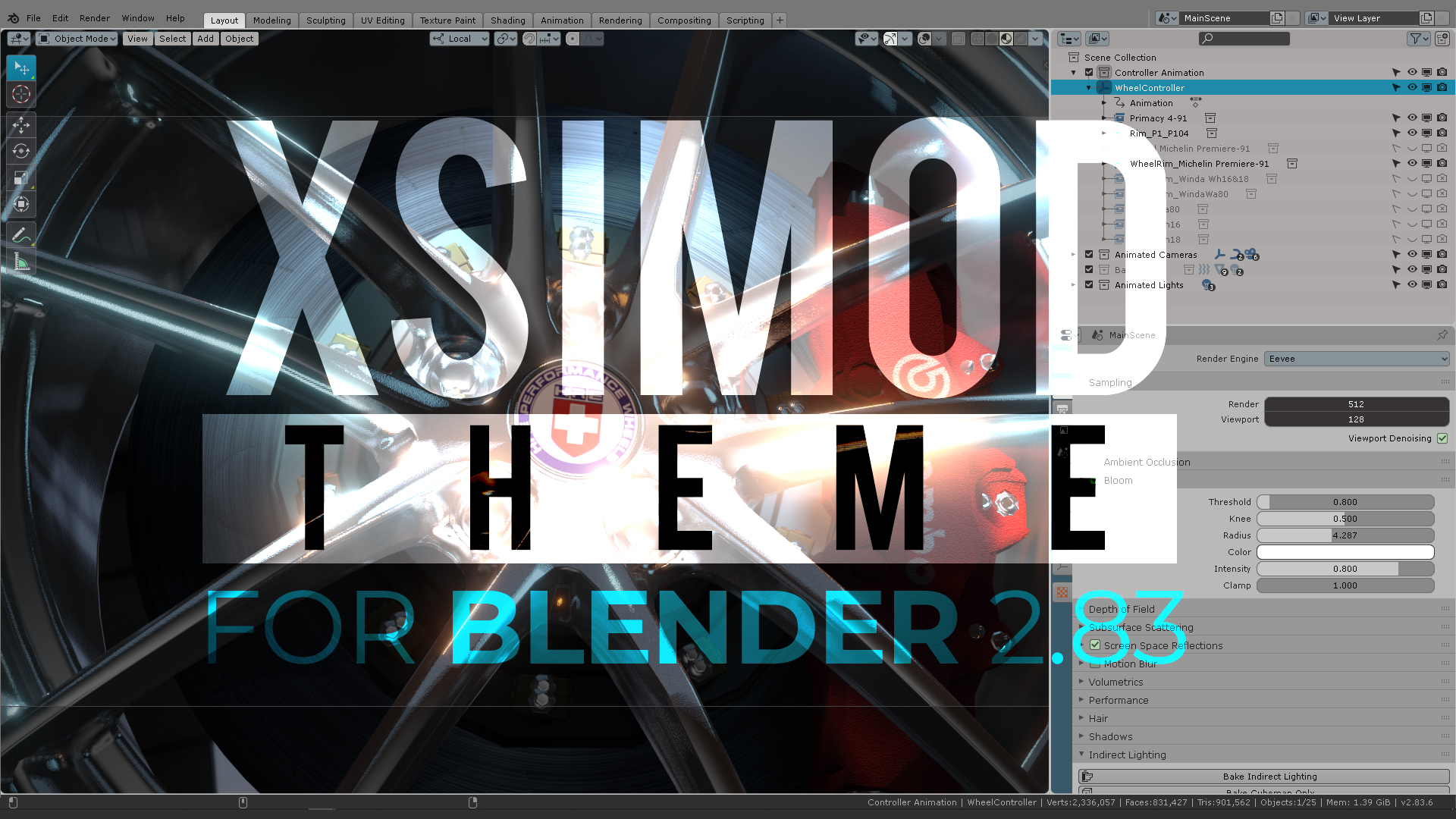
With a medium contrast background this is what you get on EDIT mode. Not suitable to work for hours of modeling.Instead, you can use a high contrast background like this to identify the bright gradient lines whenever you choose vertices/edges.(No compression image) to compare the contrast-y difference. Dark background is recommended.You remember that “SEE THROUGH” Button we mentioned earlier? Guess what’s gonna happen to your “SAVE AS” button on the File explorer…/User Interface>Tool>Selected. If you change the color here it will affect: SEE THROUGH, NEW SCENE BUTTON, VIEW LAYER, SAVE AS, Timeline “AUTOKEYING” button. This seems to be a “legacy UI” setting which now needs to be adressed. Tool is not a button and there is no clear category for them being in different parts of the UI: (TOP BAR), (Animation timeline), 3D VIEWPORT and Top menu of the workspace…Further, if you change colors and “save as” your scene, you will encounter the “Save as button” with the color you chose for “Tool>Selected”, and then you occur to press “CANCEL” you will find both buttons are now highlighted. This could be fixed by using “Inner” tag on “Save as” (rest state). I would advise to even switch the name from “Inner” to “Unselected” because by definition if the button has an “Selected” state the rest position will be the unselected state. The user can find this logical and quicker to use appropriately.The “auto contrast” function in the toolbar (which changes the icon color to something of contrast against the background) has a glitch. If you change the color of the icon on SELECTED from the left side, the Tool bar icons will not change color.Toolbar Item changes correctly the ITEM (little arrow on the lower right part of the icon), but will not acquire the SELECTED color. So “INNER” on the right side of TOOLBAR ITEM can only be drawn towards the light color (white) and it will become an Inverse contrast to the background. The same thing happens when you use black. There for, you can’t customize the color of the Toolbar Icons, you only have white or black colors./User Interface>Regular>Selected causes this to appear as a button. That “Use Nodes” should be moved to a category of it’s own in Preferences workspace options which already exist.The AUTOKEYING button is affected by “Selected” in the “REGULAR” Category from user Interface. It would be very convenient that this button was affected in it’s own “buttons” category in the Animation Timeline (Selected)In /Nonlinear Animation> “Active Action” the NLA marks the active strips, even though they are marked with an “x” as INACTIVE.This dialogue was from an “inactive action” layer and thus confirms that Blender knows this is an “inactive action”, there for the issue resides on the UI color.This is what I call “a stress test” or a “tension zone” regarding the UI. It happens when more than 5 lines cross themselves in the same interface. Observe the vertices from the monkey under the Tool bar and their contrast/identification. This is why marking “Active” as only black or white is a little bit restrictive.In the end, the XSIMOD theme will use this configuration for the correct contrast against dark background. Stress zones should not occur unless intended on the left side of the viewport./User Interface>Menu Back>Selected (left side) controls the text on the POP DOWN menu. It would be convenient to move all the text color to “Pull down” category with it’s own text color. That way all the pull down menu (pop down menu) will have the same text color at once.Some parts of the text are controlled from other parameters in the theme options, and others from /User Interface>Menu Back>Selected (left side of the menus).These menus are there for Legacy purposes only. I tried moving these parameters and they do nothing on all the subcategories. They could be labeled “Legacy Theme Space Colors”.The XSIMOD Theme correctly identifies first and last selections on the outliner with the objects in the viewport. This hasn’t been addressed in other themes. The user doesn’t know what is selected first or last, the only visual clue is the color of the white or yellow monkey. They correlate in the outliner. This is something to have in mind while designing your theme.The Tool Bar, The Outliner, the Menus, and the Selections are correctly identified in the User Interface>Regular, Tool, Toolbar item, Radio buttons. “Radio buttons” are also coming from legacy naming convention, they could be moved to a “button” category of its own INSIDE each of the subcategories. That way “Active”, “Inactive”, “Outline”, “Text selected”, “Text inactive” could organize UI elements.Radio buttons are important. But these are long buttons, and not radio.We can see some of the color inconsistencies when /User Interface>Radio Buttons>Selected is changed. You can see in the green arrows what is affecting. Also, What are symmetry buttons? Radio? Tool?/User Interface>Regular>Inner drives only certain buttons in the Top tool bar, but pressure icons are not affected by it. “Regular” is not an accurate description. Suggestion: “Inactive” instead of “Inner” and rename “Regular” to “Top tool bar” containing elements of the top toolbar.The “Auto keying” should be in the Animation Timeline category with it’s their own buttons’ color configurations for Active, Inactive, Text, Outline. Here in this capture /User Interface>Regular>Selected affects the buttons presented in the top user interface, but why affect the Auto Keying button down the Animation Timeline?/User Interface>Regular>Inner affects those buttons in the top bar.“Selected” Changes the background of the selection. Mind that when you’re designing your theme.The XSIMOD Theme has white as ACTIVE selection, since the viewport shows “Active object” in white. The outliner also reflects this in WHITE color using the “cyan” selection as consistently as the rest of the menus, pie menus, and top menus.Let’s talk about the “See through” button and how to color it without affecting the “save as” button./User Interface>Selected (from the left side menu) controls the icon colors of the sensitivity pressure bar at the top BUT NOT the icons marked with the red arrow because they are turned OFF by selecting them from the viewport. Again, the best indication here could be “inactive” from the right side menu color option./User Interface>Regular>Selected from the left side of the menu, doesn’t control the icons marked with the RED arrow when PUSHED ACTIVE. Instead, they appear colored when INACTIVE. Doing the opposite of “Selected” state./The status bar>Theme Space doesn’t seem to change any of the status bar colors at the bottom of the Blender’s interface.I tried so hard to find where this color was in the Theme options of the status bar but couldn’t find it. If you know the name of the ui color for the status name in the menus of the theme, please let me know.Stress test for overlays on top of the tool bar. So far, this works visually to organize the many lines in their own 3d space.The XSIMOD theme resolves this maintaining the selection rule for menus. Good contrast against purple icons.This is where the user can configure the TAB appearance for the properties or the work spaces.Grease Pencil tools have correct contrast with this color selection.Yellow buttons favor very important things to notice in GreasePencil, unfortunatelly, we will also get a yellow colored “Save as” button as we have shown before./User Interface>Tool>Controls all of these “INNER” (inactive) buttons. Renaming an appropriate category other than tool, or moving their buttons to their own relative work spaces (top bar, 3D Viewport, Top most bar, etc) could guide the user better.This option doesn’t work as it’s supposed to change the Item color of the button (icon) but it’s blue instead.Green Check: Expected behavior (purple), but instead we get a red arrow: color doesn’t change the toolbar icon color.Softimage DOES use darker grey workspaces. So, it is native (notice FX Viewer)Alpha = 0 controls the background of the toolbar. Toolbar Item is not reacting to any changes.Finally, the XSIMOD Theme (bar 3) with all visual issues solved.
Thank you for your patience following this thread up to here. I really appreciate it. Bear in mind that I could spend more than 19 hours (as the time of finishing this writing and the stress tests on Blender) talking about UI choices for the best recommended UIX with the XSIMOD theme, but I hope you will find these settings a great way to start customizing your own themes in Blender 2.83.
Let me know if you found solutions or if you know any additional parameters to further customize the UI.
4 thoughts on “XSIMOD THEME for Blender 2.83 (Updated March 2020)”
Brilliant analysis. Have you shared this with the Blender Foundation? couldn`t they take it into account in order to revamp Blender`s UI with the more logical and user friendly Paradigms that you have exposed from Softimage`s legacy?
More clear text, less incomprehensible iconography and redundant UI access.
Blender` s new features are incredible but it still has ways to go before being fully welcoming and intuitive
Hi Roger. I actually did, and the Blender developers are considering this as a “flag theme” to fix a lot of their inconsistencies -like you mention- on the future theming options for Blender. They don’t say that directly, but you can read about it here: https://developer.blender.org/T74360
They are -specifically- adjusting the theme with more scrutiny than the others, which is a good thing.
hi, great solution for theme designer .
hope the themes get tweaked in your design rule direction so it fits better and ist feels more equal.
selection color and outline color are broken in different themes ,like your stamentment say it.
in the mayo modo theme for example , the multiple object selection color hirachy in 3d View and in the outliner doesn’t looks quiet right.
It is hard to tell which object is the active and passive in 3d view and in the outliner and the color doesn’t match and they are different .
great work hope this will be help to bring the UI in a better shape..
thx for your hard work..


4 thoughts on “XSIMOD THEME for Blender 2.83 (Updated March 2020)”
Brilliant analysis. Have you shared this with the Blender Foundation? couldn`t they take it into account in order to revamp Blender`s UI with the more logical and user friendly Paradigms that you have exposed from Softimage`s legacy?
More clear text, less incomprehensible iconography and redundant UI access.
Blender` s new features are incredible but it still has ways to go before being fully welcoming and intuitive
Hi Roger. I actually did, and the Blender developers are considering this as a “flag theme” to fix a lot of their inconsistencies -like you mention- on the future theming options for Blender. They don’t say that directly, but you can read about it here:
https://developer.blender.org/T74360
They are -specifically- adjusting the theme with more scrutiny than the others, which is a good thing.
hi, great solution for theme designer .
hope the themes get tweaked in your design rule direction so it fits better and ist feels more equal.
selection color and outline color are broken in different themes ,like your stamentment say it.
in the mayo modo theme for example , the multiple object selection color hirachy in 3d View and in the outliner doesn’t looks quiet right.
It is hard to tell which object is the active and passive in 3d view and in the outliner and the color doesn’t match and they are different .
great work hope this will be help to bring the UI in a better shape..
thx for your hard work..
#longliveXSI