
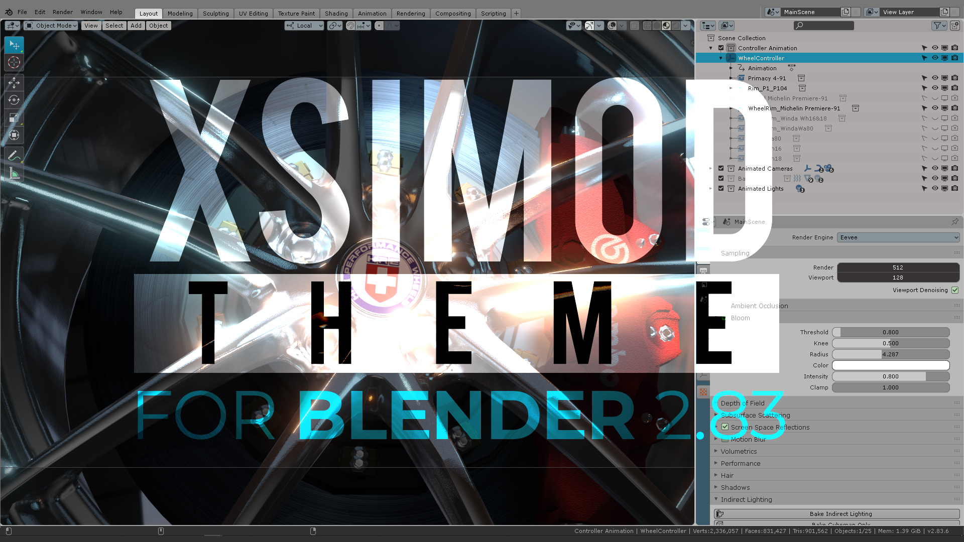
The XSIMOD Theme for Blender 2.83 went through major scrutiny for the buttons, properties, parameters, numeric boxes, selection and UI elements in general. This post is intended as a guide so you can find your way through the colors of the user interface. Here’s a complete review for…XSI UI Colors
Definition rules for HEX colors:
General UI color:![]() #aca8a7
#aca8a7
Model Module Panel color:![]() #a18aa4
#a18aa4
Menu Selection: ![]() #a18aa4
#a18aa4
Divot / Cubic button: ![]() #9eb895
#9eb895
Animation Playhead: ![]() #a2150a
#a2150a
Floating panel menu titles: ![]() #617388
#617388
Render module: ![]() #8b99a3
#8b99a3

The color palette was created according to the trends of the Windows98 colors so the users will not be alienated when the software was installed in WindowsNT machines. There for the choice for the palette had to be reduced and optimized to be non-distracting with low contrast, almost “pastel” colors.
This way, the user experience was to be focused more hours in the interface without spiky colors dispersed in diverse iconography. This task was accomplished by naming buttons instead of creating “new” icons for an ever-expanding array of tools. This is the preferred way for complex software as a design choice, considering the application can grow quickly and there is not a clear or concise way to represent complex 3d functions with Icons universally.

In the above example, to the right: We see the Animation Module which is represented by a washed green color, in contrast with the floating windows with different “animation” parameters, also coded in a different “brighter” shade of green. This is important since the green and blue colors are colors that can be watched for a long time naturally, without causing an eyesore. This color combination is why landscapes with greenery and a blue sky tend to relax us. Producing animation tasks can go anywhere between a couple of hours to a couple of years, and looking specifically at this module should be something of a routine without getting us tired.
SCROLL ALL THE WAY DOWN THE PAGE AND CLICK ON PAGE “2” to continue reading the post>>
4 thoughts on “XSIMOD THEME for Blender 2.83 (Updated March 2020)”
Brilliant analysis. Have you shared this with the Blender Foundation? couldn`t they take it into account in order to revamp Blender`s UI with the more logical and user friendly Paradigms that you have exposed from Softimage`s legacy?
More clear text, less incomprehensible iconography and redundant UI access.
Blender` s new features are incredible but it still has ways to go before being fully welcoming and intuitive
Hi Roger. I actually did, and the Blender developers are considering this as a “flag theme” to fix a lot of their inconsistencies -like you mention- on the future theming options for Blender. They don’t say that directly, but you can read about it here:
https://developer.blender.org/T74360
They are -specifically- adjusting the theme with more scrutiny than the others, which is a good thing.
hi, great solution for theme designer .
hope the themes get tweaked in your design rule direction so it fits better and ist feels more equal.
selection color and outline color are broken in different themes ,like your stamentment say it.
in the mayo modo theme for example , the multiple object selection color hirachy in 3d View and in the outliner doesn’t looks quiet right.
It is hard to tell which object is the active and passive in 3d view and in the outliner and the color doesn’t match and they are different .
great work hope this will be help to bring the UI in a better shape..
thx for your hard work..
#longliveXSI