What makes Anime look like “Anime”?
Creating the Anime look requires several processes from the drawing itself all the way to post-production. Each step adds its own distinctive appeal to the final image. Traditional animation and analog display differ from today’s modern methods of producing anime. This is why we see a great difference between the look and feel of the ’80s and ’90s anime style vs every anime series produced after 2002 with the introduction of dedicated artistic software and other digital tools.
We can use Stable Diffusion web UI to recognize what elements give retro and modern anime its unique look. You can check out the entire 15-minute review I did on video about this subject by supporting me on Patreon. I worked for a complete full month training the ckpt models, researching and taking as many as 10K+ images, filtering them, and re-exercising SD (Stable diffusion) so you can see what kind of results you can expect when you use your own 2d illustrations or 3D models as base image. The results will blow your mind.
There are 7 distinctive points regardless of what style (’80s, ’90s, or Modern) you want to pursue:
- Hand-drawn lines are drawn irregularly, this also applies to shading (light or shadows)
- Light leaks are always present because of the original physical photography room
- “Black colors” are only allowed for line artwork, Black colors are gray-ish for photography’s benefit.
- Character color palettes are defined for “day” and “night” photography (or render).
- Simplicity in shading (coloring) of the hair and clothes for characters.
- Background light wrap for the character and Background design “traditional media” brush strokes.
- Physical transmission media should be present (grain, scanlines, compression artifacting, sharpening)
Stable Diffusion ai for Anime
There are many different free available .CKPT files (or paid trained models) to create anime. Independently of what you choose to work with, the benefits to know what kind of words trigger the “correct” result you are seeking takes a lot of trial and error. Sure, there are Discord groups (which help tremendously as a collective intelligence) to find the exact prompt you need for the style you are looking for, but:
Mastering Ai Prompts is a skill, much as how you communicate with other people.
-P. Schiller
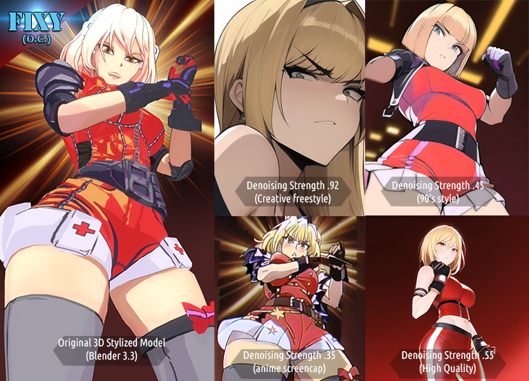
Let’s put Stable Diffusion Web UI (1.5) into action, by feeding the 3D image into the img2img tab, and using the following prompts with different denoising values:

*PROMPT* blonde anime girl wearing red and white shorts with boxer gloves, orange eyes, aggressive punching pose, strong ((dramatic lighting)),very low angle camera, 16mm lens, -use keyword here-The keywords I added at the end are described in the image. By using :
high quality shonen jump illustrationand a high denoising strength (.92, .55), I got a “creative result” from SD (1 and 4th pictures).
Since we wanted to see how Fixy (my original character) looked if she was illustrated in the 90s, I used:
90's style, '90sTo address the “anime” look itself (picture 3), I used:
anime screencapThese tests and prompts were done in Stable Diffusion 1.5 with different image size and cfg/denoising settings. The complete screencaps and parameter settings were shared as November 2022 reward for Patreons, but if you’re struggling to create a perfect anime screenshot from SD, please let me know in the comment section below, and I’ll be happy to help.
Anime illustration vs Anime show
There are some subtle differences in SD when it constructs your anime screenshot using img2img or text-to-image function and the denoising option (either too high or too low), which can deviate a mix between an “illustration” and “anime frame”, and it will look good at first… but if your intent is to animate traditionally (frame to frame in 2D) you’ll want to be able to recognize the following factors in a drawing (or generated ai image) – Use the above image to compare:
a. Too many shading variations. Stick to 1 at best for hair highlight
b. Gradient shadows / shading. It is a good idea to keep workflow and speed fast in production. Stick to 1
c. Outlines “too thick”. This is the Nº1 mistake to avoid: You want thin lines for anime. Always!
d. “Full solid black” color in the character design. Avoid this like the plague. Use a mid-gray for blacks.
e. Overly-designed character outfit patterns. Simplify shapes. No gradients. Too many highlights.
f. No light wrap. Clean and sharp black line cut and no background integration.
Overall, you need to create a shadow design for volumes and respect (stick to it) the general body shape for your character to be recognizable on-screen at all times.
P. Schiller
What makes a frame a good “anime” frame?
g. Artifacting should be present. Here we see a “clean” solid color”, which makes it look artificial
h. Gray outline as a result of “light wrap” with the background. Good!
i. Short gradient in the hair. Emphasized from light leak + light wrap from the background. Good!
j. “out of bound” blurred leaked colors (antialiasing+light wrap+compession) artifacting. Good!
k. absent “pure black” lines. Lines are dark gray and “black stripe” is a lighter “dark gray”. Good!
L. Antialiasing is clearly separated (and not smudging) the surrounding colors because the palette combination has great contrast (red, vs yellowish-white, vs reddish shadow, gray outline).
There is a lot I would like to share about this subject regarding background design, 3D animation, and Anime production in general. I explored all possible endings in November using ai as a tool for anime creation. Ai is an amazing tool for fast iterations and concept exploration, so if you’d like more of this content, let me know what interest you the most to keep the comment box working.
Cheers!
-Pierre.


