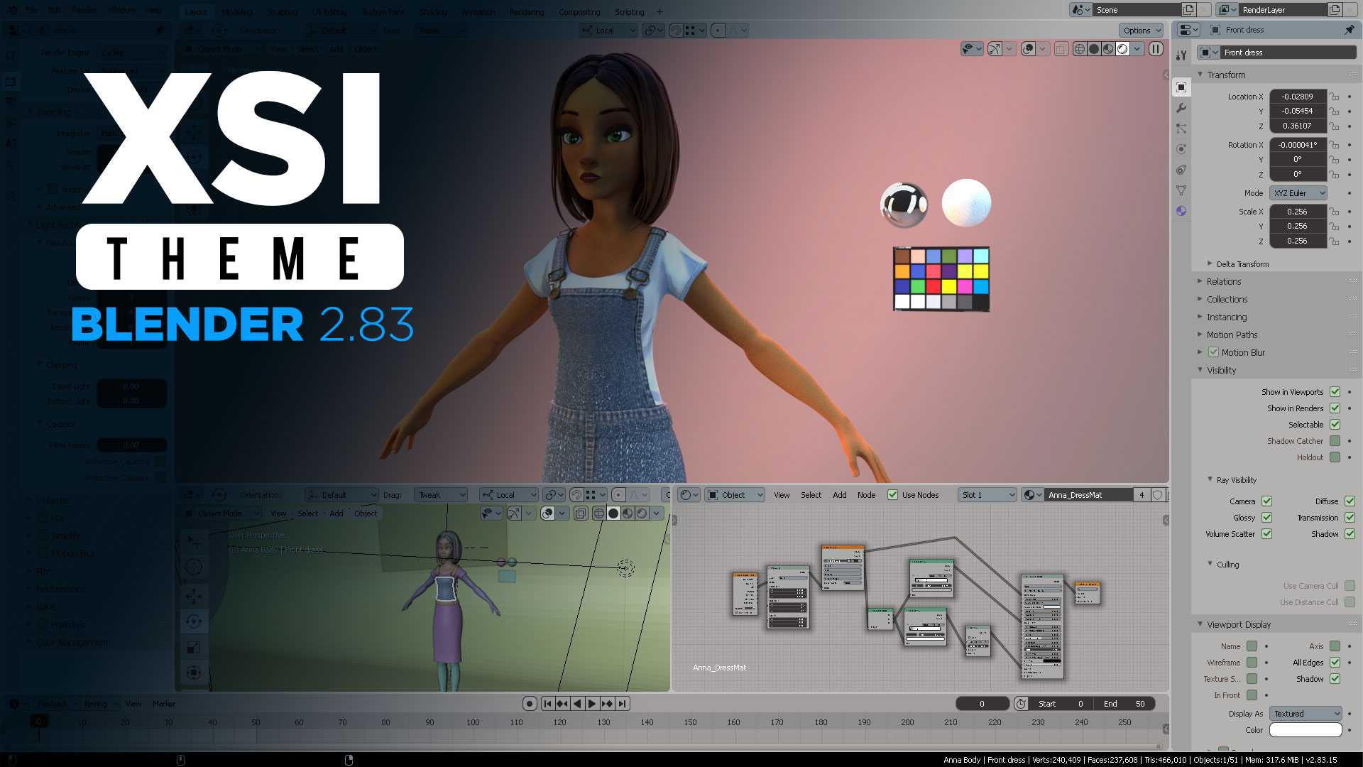
The Softimage XSI Blender 2.83 is here to review. Hopefully, we will get this as the default XSI theme in Blender.
New changes are as follows:

You can download the SOFTIMAGE theme for Blender 2.83 here>>


(RIGHT) Blender secondary selection. Correctly color-identified objects
in outliner and viewport.


Softimage has different colored modules per action: Pressing 1 will take you to a purple-themed UI (geometry creation and modification). Pressing 2 will take you to a green-themed UI (animation). Pressing 3 will take you to a pale cyan UI (render). Pressing 4 will take you to a pale blue sky (ICE) interface. Pressing CTRL+1 will take you to an melon color UI (simulation). Pressing CTRL+2 will take you to an orange UI (Hair).
Color #3 scheme is Render which is the most used module after a work in 3D is completed. I reflected this on the Blender UI.
This becomes the basis for me to distribute these colors in the appropriate workspace in Blender so the Softimage user can identify their workflow in it, quickly.


Softimage menu has a high contrast whiter background after opening a subcategory on the menu. In Blender, I decided to keep the sub menus in the SAME color than the grey-ish UI because there are NO DETACHABLE menus at the moment in Blender. You can notice a little scissors icon which means it is to be “tore” and FLOAT on top of the UI. Blender doesn’t have this function and therefore it is better to keep levels and sub-levels at the same color scheme than the main UI.

In Softimage the camera has a dark blue color and the scene root has a green (bold) text color. In Blender I translated that in the outliner COLLECTION green colored and the camera continues to be in a dark blue color for contrast principle in the viewport.
You can also notice in Blender that the SHADER icon is now correctly colored in purple as in Softimage.

In Blender the outliner now reflects when an object is on EDIT MODE by turning YELLOW which is the global constant for editing anything in the UV editor and Graph editor. You can compare the same behavior on Softimage when an object enters edit mode in yellow color. Also, notice Collection is green colored just as its equivalency in Scene Root from Softimage.
I chose not to color the SCENE in green color in Blender because seldom we see a user identify a large collection of SCENES in an Outliner. It often happens that scenes are mostly used in the Sequencer, and scene clips are ALREADY green-themed there.


PLEASE SCROLL ALL THE WAY DOWN IN THE PAGE TO CONTINUE TO THE NEXT PAGE.


6 thoughts on “Softimage XSI Blender 2.83 theme (May 2020)”
Great article! Love the unified color schemes. 🙂
Are the bottom images supposed to be clickable? If so, they are not atm.. 😉
Keep up the great work, kudos!!
I’m a longtime XSI user that switched to 3DSmax. I just stumbled across your blog post. I’m going to download the current version of Blender and apply your theme. Thank you!
That’s cool. I hope you like it.
Awesome. Will this still work with the most current release? I still use Softimage 2005-2013 for general modeling and such in 2022 as I’ve always loved the toolset and how easy it was to navigate over blender, but it’s been years since I even bothered to try Blender again.
I need to publish on my GitHub, the most recent XSI theme for Blender 3.3+
I’m looking forward to XSI theme for Blender 3.3+ hope to see it soon, thank you for such great work.